Writing

Volatile afterimages: the videotaped beating of Rodney King
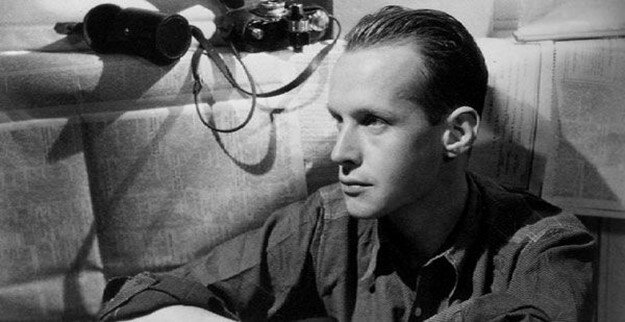
In 1991 George Holliday told reporters he bought a home video camera to record "home stuff", "a cat licking its paw". Holliday's life changed forever when he hit record on police arresting a man outside his apartment. Up until his death on Sunday September 22, 2021, Holliday's life was linked to that single piece of footage.
Licensing Holliday's footage as part of ACMI's #storyofthemovingimage we came to a greater understanding of the indelible afterimage his footage left on him and the late 20th Century.

FBI report | George Holliday with his SONY Handycam CCD-F77 | Original photograph John T. Barr/Gamma-Liasion
George Holliday, the man who recorded the beating of Rodney King by police officers in 1991, passed away at a Los Angeles hospital on Sunday 20 September, 2021, aged 61. His death was reportedly due to complications relating to Covid-19.
In an era of increasingly centralised image archives and footage libraries, Holliday was unique, up until his death, licensing arguably one the most recogniseable pieces of footage of the late 20th Century involved negotiating with its creator.
In 2019 we were engaged by ACMI's Chief Curator Sarah Tutton and Assistant Curators Julia Murphy and Chelsey O'Brien to produce a series of museum screens on citizen journalism and the inherent power of images for ACMI's Story of the Moving Image exhibition. Locating and licensing Holliday's footage of Rodney King's arrest put us in contact with the man behind one of the most volatile pieces of footage ever committed to magnetic tape.

The Videotaped Beating of Rodney King in situ, ACMI Story of the Moving Image, Federation Square Melbourne.
Shortly after 12:30 a.m. on Sunday 3 March, 1991, George Holliday, a Los Angeles plumber, would record several minutes of grainy video footage on his newly-purchased Sony Handycam that would shock America to its core and alter the course of his life.
When Rodney Glenn King’s white Hyundai Excel was pulled over for speeding by police in the early hours Sunday morning, what should have been a simple traffic violation escalated into a brutal beating at the hands of the Los Angeles Police Department (LAPD).
Moments earlier, California Highway Patrol (CHP) allege that they observed King driving at over 100 mph on Foothill Expressway. When King failed to stop, the CHP radioed the local Foothill Division of the LAPD for assistance.
As King exited the Expressway at Paxton Street in the San Fernando Valley, five police cars and a police helicopter were in pursuit. King would run at least one red light before eventually coming to a stop outside 11777 Foothill Terrace Boulevard.
At the nearby Mountain Back Apartments residents were woken up by the noise of police sirens and a helicopter hovering overhead shortly after 12:30. At the time Sylvia Sales told LA Times reporters she heard a police officer instruct King to “pull over or you’ll get hurt” over a loudspeaker.
Although up to a dozen people witnessed King’s arrest, none reported seeing King charge at police or reach for a weapon. Their accounts would later contradict the official police reports. “He never moved his hands” Josie Morales, told the LA Times, “the driver moved away from the car and laid down”. Dawn Davis, said she saw up to six police officers wrestle King to the ground and hit him.
As King lay on the ground, Holliday started filming from his second-storey balcony, “I didn’t see the very beginning of it, I thought maybe he tried to hit a policeman or something, but I don’t know I don’t know, I didn’t get that part on tape either” Holliday later told reporters.

A still taking from the FBI analysis of the Rodney King beating. Courtesy Prelinger Archives.
In the attack, King was tasered twice, struck with police batons more than 56 times, kicked in the head and body, had his eye socket cracked, his cheek bone fractured and his right angle broken; he also suffered third degree burns and was left with numerous facial lacerations.
““What happened out there was wrong””
When what Holliday assumed was a high-profile arrest failed to make the local news, Holliday decided to act, “what happened out there was wrong”.
KTLA Los Angeles first broadcast Holliday’s footage as part of the 10pm news on Monday 5 March, 1991. The public outcry was immediate, KTLA’s switchboard was inundated with calls. The following day, Holliday’s video was syndicated to CNN, within days it would appear on screens around the world.
In the fallout the LAPD claimed King’s violent arrest was an isolated incident, but for civil rights groups it was consistent with the rough justice regularly levelled at minorities and African-Americans by police in Los Angeles’ poorer neighbourhoods.
“[This] is not an isolated incident – the difference this time is that we have proof … on tape” Ramona Ripstein executive director of the Southern Californian chapter of ACLU said at the time.
On Thursday 15 March four LAPD officers we indicted on charges stemming from King’s arrest: Sargeant Stacey Koon, Theodore Briseno, Timothy Wind and Laurence Powell. Within days the Justice Department and the FBI launched investigations into the incident.

The FBI enlisted state of the art computer technology to analyse the beating of King by LAPD officers.
At the trial Holliday’s video was the single-most important piece of evidence. In the courtroom individual frames were scrutinised as prosecutors and defendants extracted every fragment of information the footage contained. The FBI engaged state of the art technology to recreate CGI figures of the beating. In other tests officers struck rubber blobs with nightsticks to measure the force of impact levelled at King’s body.

Theodore Briseno, one of four LAPD officers on trial for the beating of Rodney King, stands before George Holliday’s video in a courtroom.
When the four officers were acquitted of all charges by a mostly white jury in Simi Valley over a year later. Their decision seemed to fly in the face of the brutality captured on Holliday’s videotape.
“The jury’s verdict will never blind what the world saw,” Los Angeles Mayor Tom Bradley told reporters after the verdict was handed down.
In downtown L.A. as shopkeepers prepared for the worst, an anonymous woman told a camera crew “it was on film, we saw them beating that man”. The outrage at the court’s ruling would see fires and violence erupt at flashpoints across the city.
The L.A. Riots lasted more than five days and resulted in 63 deaths, 2,383 injuries, more than 12,000 arrests, and over USD$1 billion in property damage.

George Holliday with Sony Handicam on the balcony of his Foothill Terrace Boulevard apartment in 1991 (still from KTLA-5 News)
“It was almost like I was watching something on a tiny television – images more than reality”
Just as Darnella Frazier’s footage of George Floyd’s death at the hands of police in 2020 sparked protests in Minneapolis and saw thousand march in Black Lives Matter protests across much of the United States. The afterimage that persists from these citizen journalists serves as a reminder that systemic racism, police brutality and abuse of power remains an ongoing issue in America.

Digital stasis: the September 11 footage orphaned to YouTube
Footage inextricably linked with our collective memories of the September 11 terrorist attacks is noticeably absent from commemorative news coverage. This is the story of attempting to license some of the most visceral amateur footage captured on that day.

Video still of United Airlines Flight 175 on the morning of September 11, 2001
As images of the September 11 terrorist attack on the World Trade Center in New York circulate on our screens once again. Those who recall news coverage 20 years ago might experience a form of dissociative amnesia from the absence of images once synonymous with the event.
Shortly after American Airlines Flight 11 collided with the north tower at 8:46 a.m. on September 11, 2001, news crews instinctively positioned themselves due north of the impact zone. With the north face of the north tower ablaze and billowing smoke into the New York skyline, Lower Manhattan provided the most unobstructed views of 1 WTC.
But it would be footage of the second plane, United Airlines Flight 175, colliding with the south tower (2 WTC) at 9:03 a.m. captured by two non-professional videographers; Canadian artist Luc Courchesne and Michael Hezarkhani, that would provide some of the most arresting images of that day.
Included in rolling new coverage in the days and weeks that followed, Courchesne and Hezarkhani’s footage would became inextricably linked our collective memories of the event. But today both clips are noticeably absent from commemorative news coverage and recently released documentaries Turning Point: 9/11 and the War on Terror (Netflix) and 9/11: Life Under Attack (ITV/History Channel).
With the eyes of world focused on the north tower, Hezarkhani single-handedly captured arguably the most visceral footage of the attack on the World Trade Center. Reportedly atop the Staten Island Ferry in New York Bay at the time. Hezarkhani’s camera was initially trained on the north tower, but when the Boeing 767’s engines roared overhead he instinctively zoomed out in time to capture it collide with the south tower’s superstructure.
In late 2019 we attempted to license Hezarkhani’s footage from a prominent image library as part of a series of screens we produced for ACMI’s new museum experience: The Story of the Moving Image. After initial enquiries regarding licensing fees, the discussions hit a wall when the vendor announced they were unable to contact the rights holder.
Although it’s been uploaded to YouTube and Daily Motion, Hezarkhani’s footage exists suspended in a digital stasis - available for anyone with an internet connection to see, but perpetually unable to re-enter circulation.
Eventually we settled on alternative footage of United Airlines Flight 175 on the morning of September 11, but it came with a caveat from the vendor: “do not use the plane hitting the tower”.
Shot from a helicopter by a professional news crew somewhere due north of Lower Manhattan, the moment of impact was completely obscured from view. Clearly our collective amnesia of September 11 footage works both ways.
This article is written with respect to the victims and survivors of the September 11 terrorist attacks that killed 2,977 people and injured thousands at the World Trade Center, the Pentagon, and Pennsylvania.

A$10M Buxton Contemporary opens in Melbourne’s Southbank arts precinct
Dedicated solely to Australian contemporary art produced after 1980, Buxton Contemporary will house the $10 million Michael Buxton Collection (MBC) of over 300 works produced by 58 artists amassed by Melbourne property developer Michael Buxton over the last two decades.
First published The Art Newspaper (print edition) March 2019

Image supplied
On March 9, 2018, a new art museum will open in Melbourne. Adjacent to the National Gallery of Victoria and just a short distance from the Australian Centre for Contemporary Art sits the latest addition to the city’s rapidly evolving Southbank arts precinct. Buxton Contemporary is a 2,200 square metre, two-storey, purpose-built museum, designed by architects Fender Katsalidis and constructed on the grounds of the University of Melbourne’s Southbank Campus.
Dedicated solely to Australian contemporary art produced after 1980, Buxton Contemporary will house the $10 million Michael Buxton Collection (MBC) of over 300 works produced by 58 artists amassed by Melbourne property developer Michael Buxton over the last two decades.
The collection, along with $16 million towards construction and operational expenses was gifted to the University by Buxton in an arrangement that will see his collection gradually shift from private hands to a semi-autonomous management structure overseen by the University.
“I’m on the committee for the next twenty years, that’s pretty-long, especially when you’re 73,” Buxton tells The Art Newspaper ahead of the museum’s official opening.
Buxton is executive director of MAB Corporation, a construction firm he started with his brother Andrew in 1995, that has to date overseen $11 billion in building projects.
In 1995, despite little knowledge of contemporary art, Buxton started collecting. An astute businessman, he applied similar principles to art collection and engaged an advisory panel of experts and charged them with the task of building a significant collection of Australian contemporary art.
“We talked about what a museum collection means and came up with the idea that if you’re going to collect art [ … ] then you should collect them in depth over a period of time,” Buxton says.
Artists in the collection include internationally recognised names such as Patricia Piccinini, Bill Henson and Tracey Moffat; alongside early-career artists like Nick Mangan, Jess Johnson and Paul Yore.

Nicholas Mangan Dowiyogo’s Ancient Coral Coffee Table, 2010 (image supplied)
MBC’s commitment to its artists has been a blessing for those in the collection. “Michael has been one of my biggest supporters,” says Nicholas Mangan a 38-year-old Melbourne-based multidisciplinary artists. “It’s a continual dialogue with a particular collection and a fostering of your practice over a longer duration, which is unique in Australia,” he says.
With the majority of the collection housed in a warehouse space, the MBC would often lend artists’ works to other institutions. In 2017 when Mangan staged a solo exhibition at KW Institute in Berlin, it featured his coral limestone sculpture Dowiyogo’s Ancient Coral Coffee Table (2010), from the collection.
Now with the opening of Buxton Contemporary just a few weeks away and the collection about to enter a new phase, Buxton is magnanimous about the future of the museum that bears his name, “We’re probably going to see more of the art than we have in the last 20 years. It’s just fantastic to be able to share it with everyone,” he says.
Buxton Contemporary will open its doors on March 9, with the first exhibition The shape of things to come, curated by Melissa Keys and featuring 20 artists from the collection.

Buxton Contemporary (image supplied)

Buxton Contemporary (image supplied)

Buxton Contemporary (image supplied)

Graffiti: Art of the tag
Tagging, the act of writing your graffiti name with spray paint or markers, is one of the most maligned, misunderstood and prosecuted forms of self expression.
From its early beginnings in struggling New York City neighbourhoods to suburban Australian alleyways, artists and some members of the public remain divided over the artistic value of graffiti.

"Bald", a graffiti writer, in an abandoned factory in Melbourne's west. Photo: Allissa Oughtred.
https://www.abc.net.au/news/2016-02-04/the-art-of-graffiti-tagging/6959396
Originally posted: 4 Oct 2016, 10:09am
Tagging, the act of writing your graffiti name with spray paint or markers, is one of the most maligned, misunderstood and prosecuted forms of self expression.
From its early beginnings in struggling New York City neighbourhoods to suburban Australian alleyways, artists and some members of the public remain divided over the artistic value of graffiti.
Chapter I
Graffiti finds colour in poor New York neighbourhoods
In an era where street art and graffiti murals have never been more acceptable to society, tagging has a serious image problem: it's associated with gangs, it's considered mindless vandalism and it challenges our ideas of property ownership.
Even within graffiti culture, tagging is often overshadowed by murals or confused with other forms of graffiti marks like throw-ups (usually two letters consisting of an outline and a fill).
And if you add street art to the discussion, for the uninitiated the delineation of tagging will be as hazy as the fumes from a can of spray paint.
These factors make it difficult to have an intelligent discussion about the origins, motivations and aesthetics of tagging with even the most open-minded people.
Have we been preconditioned to dislike tagging, or is it an activity that has little or no aesthetic value?

Tags adorn a lock-up garage in the Melbourne suburb of Balaclava. Photo: Allissa Oughtred.
University of Melbourne graffiti scholar Dr Lachlan MacDowall said tagging was the cornerstone of graffiti culture that emerged from the impoverished neighbourhoods of New York in the late 1960s.
"Tagging is a prototype for a mural," he said.
"There is a direct link between a tag that became more and more ornamentalised and eventually became this full colour burner."
In 1971, when the New York Times published an article about TAKI 183 — one of the very first recorded graffiti artists — it didn't matter that he was a poor teenager from Manhattan.
At the time his tag was so prevalent on the New York City landscape, it was as recognisable as any actor with their name up in lights on Broadway.
Despite the city's high unemployment, tagging put fame, admiration and respect within reach of even the city's poorest inhabitants.
And now, more than 40 years later, tagging still offers the same rewards.
"When you're young and powerless, graffiti is an easy way — well, not that easy — to earn the respect of your peers with nothing but your own hard work," a graffiti artist from Melbourne's East named Paul said.

Paul, a graffiti artist from Melbourne’s east, walks down an alleyway. Photo:Allissa Oughtred.
Chapter II
Tourism drawcard versus illegal scrawls
In the early 1980s the first glimpses of New York graffiti arrived in Australia via documentaries such as Style Wars (1983) and books like Subway Art (1984).
And it did not take long for the culture to take root, possibly due in part to the political and protest graffiti culture that already existed in our cities, as evidenced in photographer Rennie Ellis' book Australian Graffiti (1975).
Attitudes to urban art have shifted significantly in the last four decades. Where once the vast majority of graffiti was viewed as vandalism, an explosion in street art in the late 1990s has lead to a greater appreciation of all forms of urban art, including graffiti murals. But tagging remains exempt from this shift in attitude.

A two colour tag by the late SINCH in the Melbourne suburb of Balaclava. Photo: Allissa Oughtred.
In a few short years, street art became such an important part of the Melbourne tourism experience that now it seems no trip is complete without visitors taking a selfie in one of the city's famed laneways.
Many other cities now seem keen to also capitalise on street art's popularity with tourists.
But while local governments encourage some forms of urban art at the expense of others, in terms of the law, the delineation between legal and illegal has not been so clear cut.
University of Melbourne criminology professor Alison Young said it did not matter whether it was street art, graffiti or tagging, a crime was a crime if the work was done without permission
"They [all] constitute a crime of marking graffiti or the crime of criminal damage or wilful damage," Professor Young said.
"The only difference lies in how the laws are enforced.
"In order to exercise discretion against prosecuting there needs to be some aesthetic justification, and for many people in society tagging doesn't provide that."

A city of Yarra employee removes tags from a shopfront in Collingwood, Victoria. Photo: Allissa Oughtred.
Chapter III
Australia finds its own graffiti 'wild style'
Dr MacDowall said some of the reasons people struggled with tagging was illegibility, placement and advertising-like repetition across multiple locations.
"It's intelligible in terms of communicating a message ... the placement, the way that the letters are working together; the use of materials; the flow ... none of those things are really making sense," he said.
But to deny tagging has any aesthetic value is to overlook the 40-year development of local hand styles.
As graffiti culture took root in Australia, regional styles evolved, and in Melbourne a distinctive "wild style", complete with suburban varieties, emerged.
Distinctive letterforms scrawled along train lines and could be traced back to early graffiti writers.
"You can go to Frankston and see a style that is very popular around that area, and then go to Hurtsbridge and see a completely different style," MC, DB, TSF graffiti crews member "Muscles" said.
"It's a certain type of tribalism, localism."

A graffiti writer in an abandoned Hitachi train in Melbourne's West. Photo: Allissa Oughtred.
Chapter IV
Taking tagging ownership
Perhaps the most troublesome aspect of tagging has been its placement.
Since the very first tags appeared on New York's transport network, tagging has challenged property ownership laws.
"If someone sprays a tag on your wall, [he or she] sees it as something that they have a right to alter, and that's a right, not based on like a legal writ or a document of ownership, but its a right based on proximity, from the fact that the wall kind of adjoins public space, the street, the pavement," Professor Young said.

'Jokes', a graffiti artist from Melbourne's West. Photo: Allissa Oughtred.
Much like advertising, graffiti is about impact, and many prolific taggers justify what they do as retaliation against the proliferation of corporate advertising.
"It is like the human response to hard-edge corporate logos ... that you can't go and buy at the shop," Clarke Aaron of Giant Productions, a Melbourne urban art supplies store, said.
Professor Young agreed: "One reason why tagging is challenging or unpopular, controversial, is because it's making explicit the idea that you don't have to buy into that kind of corporate culture, that you can create your own."
Although we tend to pay little attention to advertising, we are often quick to denounce tags as selfish acts of mindless vandalism.
But in a world where public space is sold off to advertisers, and where savvy brands are quick to co-opt elements of subcultures to push their products, tagging is one thing that is not for sale.

A fence with tags in the Melbourne suburb of Balaclava. Photo: Allissa Oughtred
Just like the political and protest graffiti that was once prevalent in our cities, in today's image-based culture, tagging serves as a reminder that in a democracy there will always be a way to challenge the status quo, seek notoriety, or simply engage in anonymous public mark-making.
"At the end of the day it's some paint on the wall; it doesn't matter. You can paint back over it and make it boring grey again," ZFG graffiti crew artist "Jokes" said.
Credits
Reporting: Tim Stone
Photography: Allissa Oughtred

Howard Arkley's lust for suburban life
Howard Arkley (and friends...) at Tarrawarra Museum of Art was a retrospective of one of the most important Australian painters of the 20th Century, and the first major exhibition of Arkley's work since the exhibition Howard Arkley at Ian Potter Centre NGV Australia in 2006.
First published on ABC News Online December 2015

Howard Arkley in front of one of the houses he painted in his House and Homes series, 1988.(Supplied: Martin Kantor)
Howard Arkley (and friends...) at Tarrawarra Museum of Art is a retrospective of one of the most important Australian painters of the 20th Century, and the first major exhibition of Arkley's work since the exhibition Howard Arkley at Ian Potter Centre NGV Australia in 2006.
Spanning the entire floor space of the publicly owned, privately and publicly funded art museum in the Yarra Valley, Howard Arkley (and friends...) features more than 60 major works.
This is a comprehensive exhibition that covers everything from Arkley's iconic house paintings through to previously unseen early monochromes, collaborations with his friends, selected items from his archives, and even a soundtrack of the artist's musical inspirations.
Born in 1951 in the Melbourne suburb of Box Hill, Arkley is perhaps best known for the eye-popping depictions of suburban homes rendered in electric colours that he created when chosen to represent Australia at the 1999 Venice Biennale.
When he died of a heroin overdose on July 22, 1999, five weeks after his triumph at the art world's greatest exhibition, those suburban images assumed icon status in Australian art, overshadowing much of his other work.

Howard Arkley: Theatrical Facade, 1996: synthetic polymer paint on canvas (203 x 153cm). Supplied: The Estate of Howard Arkley. Courtesy Kalli Rolfe Contemporary Art
Arkley: Redefining Australian art
In the same way that Arkley and a new generation of artists redefined Australian art — from outback landscapes to abstract art — in the 1970s, Howard Arkley (and friends...) attempts to redefine the public image of Arkley by paying homage not just to where his work ended up, but where it evolved from: abstraction.
"They were called the new wave of Australian art and they looked at work from overseas with what was called a second-degree attitude," exhibition co-curator Victoria Lynn says.
"They were happy to be understood as artists appropriating ideas and idioms from overseas."
Arkley was part of a generation of artists that inherited an interest in abstraction that filtered into Australia from America through major touring exhibitions like 1967's Two Decades of American Art at the National Gallery of Victoria's former Swanston Street site.
Although 16-year-old Arkley did not see the exhibition that featured works by Andy Warhol, Willem De Kooning and Ad Reinhardt, he experienced them in the second-degree, through reproductions in the exhibition catalogue which he owned — fragments of which now reside in the State Library of Victoria's extensive collection of Howard Arkley archives.
For Arkley, that once-removed experience became a recurring theme in his work.
"I wanted my work to look like a reproduction of a painting, not be a painting. I wanted it to look like it was a slide or a book, I wanted it to look like the paintings that educated me and I saw them in reproduction in books and magazines and slides etcetera," Arkley proclaimed in the 1999 ABC documentary Howard's Way.
1,689 artworks, 33 sketch books, 48 notebooks
Acquired from the Arkley estate by the State Library of Victoria in 2011, Arkley's archives comprise over 1,689 artworks, 33 sketch books, 48 notebooks, as well as a large collection of source material, exhibition ephemera, photography, objects and more.
Arkley drew on his personal archive to develop new works of art; for Tarrawarra Museum of Art curators Victoria Lynn and Anthony Fitzpatrick, the archives revealed a more complex picture of the artist and his methods.
"We've been able to unearth many of the processes, notes, visual diaries and collages he used in preparation for his paintings," Lynn says.
Located throughout the gallery space are display cases that house sketches, collages, photocopies and notes, often alongside the corresponding finished works of art.
Much has been said about the influence the suburbs had on Arkley, but until now very little has been said about the influence music had on his artistic output.
For Dr Chris McAuliffe, art critic and author of the catalogue essay Raw power meets electronic music sounds - Howard Arkley and Popular Music, the countless references to lyrics, song titles and album names he found scattered across the artist's visual diaries highlighted the importance of music to Arkley.
"Sometimes it's almost as if he's making a drawing while listening to a song, sometimes you get a sense that he's heard a pattern or a structure in the music and he's tried to annotate that and see if he can translate it into a painting," McAuliffe says.
"And then other times, it's almost as if he's free associating words looking for titles."

Howard Arkley: Zappo Head, 1987: synthetic polymer paint on canvas (182.5 x 168cm). Bendigo Art Gallery, Victoria. (Supplied: The Estate of Howard Arkley. Courtesy Kalli Rolfe Contemporary Art)
Just add jazz …
A selection of jazz, punk, new wave, experimental and electronic tracks, curated by Lynn and Fitzpatrick, accompany the works in three of the four Tarrawarra gallery spaces.
Some rooms have headphones and listening stations, while the main gallery has an intermittent soundtrack that includes the likes of Muddy Waters, Nick Cave & The Bad Seeds, Blondie and Talking Heads.
In the fourth gallery space, a long, thin expanse with views to the Yarra Valley known as the Vista Walk, hangs the 'and friends...' component of the exhibition.
Featured are collaborations between Arkley and Elizabeth Gower, Christine Johnson, Juan Davila and John Nixon; and works by his friends: Alison Burton, Tony Clark, Aleks Danko, Elizabeth Gower, Christine Johnson, Geoff Lowe, Callum Morton, Kathy Temin, Jenny Watson, Constanze Zikos and Peter Tyndall.
Howard Arkley (and friends...) pays homage to the things that inspired Arkley: his friends, his music, his art and his process.
Arkley knew that art was as much about the journey as the destination.
"In interviews Arkley openly spoke about his sources, in fact in several exhibitions he displayed a lot of it alongside his work," Fitzpatrick says.
"He wanted to foreground that process behind his work, in a way it was as much his work as the finished product on the canvas."
Arkely knew how to filter out what was important from the information around him; he spent the best part of three decades collecting, processing and producing stunning paintings from everyday images, while at the same time letting music and culture seep into his work.
In a world now awash with images, emoticons and memes, and an endless supply of music at our fingertips, we can only imagine what kind of art he would make today.
Howard Arkley (and friends...) is on at the Tarrawarra Museum of Art until Sunday February 28, 2016.

2014 Adelaide Fringe - A Simple Space by Gravity and Other Myths
It all begins with an idea.

Posted: Friday, 14 March 2014 at 11:46am
https://web.archive.org/web/20140319090949/http://www.abc.net.au/arts/stories/s3963355.htm
A Simple Space is the latest show from Adelaide-based circus company, Gravity and Other Myths. The company consists of eight young performers, most of who have trained together for many years at South Australia's famed Cirkidz, circus school.
Gravity and Other Myths have been performing their unique brand of 'new circus' at the Adelaide Fringe for four years, each year going from strength to strength, and gaining audience and acclaim. The hour-long show is packed full of spins, flips, aerial tricks and muscular acrobatics. The performers play to their strengths, incredible circus skills presented in a tongue-in-cheek style. There is great rivalry in the group. They’ll often try to outdo each other to win the audience's affection. A Simple Space played a sold-out season at the Royal Croquet Club, a pop-up space on Victoria Square, Adelaide.
- Produced by Tim Stone, filmed by Carlo Zeccola.
Related content
Read >> Five of the best from Adelaide festival season
Watch >> Sammy J and Randy's guide to Adelaide Fringe

Philip Brophy: art, sex and psychosis

Frames from Colour Me Dead—Chapter 5: The Hungry Vagina, 2013
synchronized high-definition animation displayed on 3 monitors, sound, 6 minutes
© Courtesy the artist and Anna Schwartz Gallery
Originally posted: Wednesday, 7 August 2013 at 12:05pm
For more than 20 years Philip Brophy has been contemplating the way sex, violence and dead bodies have been represented in cinema.
An artist, filmmaker, cultural theorist and musician, Brophy has explored many of these ideas in the broad scope of his art practice. He did so in 1988 with the 57 minute film, Salt, Saliva, Sperm & Sweat which explores how an office worker's existence is dictated by his bodily functions and now again in his exhibition Colour Me Dead, currently on show at the Ian Potter Museum of Art at the University of Melbourne.
"Salt, Saliva, Sperm and Sweat is an essay film," Brophy adds, "a pretentious intellectual exercise to make that kind of point [...] that where there's going to be images of sex there's going to be violence in those images and whenever there's images of violence there's going to be sex in it."
Born in 1959 in the northern suburbs of Melbourne, in his late teens Brophy formed the post-punk band, cum experimental art group Tsk,Tsk,Tsk. By the 1980s he was collaborating with numerous artists in Melbourne's then dynamic art scene, staging events and creating experimental films, video and art. He also began to address what he describes as the 'rampant body-ness of contemporary times', in films like Salt, Saliva, Sperm and Sweat and in his 1993 feature, Body Melt, a film about residents of a small town who unknowingly become test subjects for an experimental body eating drug. To this day cult movies fans, including Quentin Tarantino, maintain that Body Melt is one of Australia's finest 'Ozploitation' movies.
For the past three years Brophy has dedicated endless hours reviewing more than 3000 works of art. He has literally travelled the globe to look at paintings from Neoclassicism through to the post modern era, from 1700 to the 21st century. "You have to look at these works in person because you definitely can't get it from a book," Brophy explains.
At the end of this viewing odyssey, Brophy has come to the conclusion that the art establishment needs to re-evaluate or at least acknowledge that there is a psycho sexual overtone in the way men have visualised women.
His research has culminated in a large-scale exhibition of images, animations and films, shown across three large exhibition spaces at the Ian Potter Museum of Art. Colour Me Dead features six new digital works based on key motifs that run through the canon of art history. In his research Brophy has grouped together works that maintain certain elements across a period of 300 hundred years: women in nature, women in water and hybrid depictions of sexuality.
For example, the grouping The Morbid Forest illustrates how, for more than 300 years, the female figure has been portrayed, often in vulnerable states, in forest settings.
Brophy's research is attempting to counter a simplistic argument that somehow cinema was responsible for the violence that appeared to be permeating society. What he maintains is that the implied sexualised violence on the movie screen can be traced back to the work of artists over the past 300 years.
"In the 1980s there was a really naive idea that cinema somehow created that [sexual violence] phenomenon," he says, adding "I never really bought that argument."
Having worked as a director, Brophy has seen firsthand how works of art are readily referenced for inspiration during the production process.
At the The Louvre in Paris and London's Tate, Brophy found key works of art in his research often hung in obscure spots, away from the crowds assembled to view masterpieces from the Italian Renaissance or Leonardo da Vinci's Mona Lisa. It is as if these revered institutions are almost slightly embarrassed by these works of art. For Brophy, the art institution is part of the problem when deciphering the history of sexuality in art.
"When you read the background literature [of these paintings], or you try to find the authoritative voice, all they talk about is truth, beauty, nature, the artist's vision, but I'm thinking 'what about the nude women here?'."
"There's a lot of showing women in intensely bright light, then there's lots of women just lying in the forest, then there's this thing where the painting just seems to be a vagina," he says.
"I can't be the only person that sees these things, I don't think it's a revelatory thing to look at these paintings and think 'that looks pretty unsavoury', " he adds.
Brophy argues that the 'unsavoury' way the female form has been represented throughout art history didn't simply end with the dawn of Modernism. "There was [then] a general momentum in painting to slowly destroy the nude," he says. Modernism made a scapegoat of the female nude because it was a symbol of all art that preceded it. In the process of killing off the 'old art', artists often disfigured and dismembered symbolic representations of naked women. "Each artist did it in their own way," Brophy says, pointing out the work of Marcel Duchamp, Pablo Picasso and Jackson Pollock.
Brophy suggests Duchamp very intellectually dismantled earlier modes of representation, for example his 1912 painting, Nude Descending a Staircase, No. 2 features a female form literally split into a two dimensional plane as it appears to move through time, while artists like Picasso and Pollock attacked it in a more expressive and intuitive way. Recalling one of Picasso's later paintings, Nude Woman with Necklace (1968), that he saw in the Tate, Brophy says "it's a messy, contorted almost, kind of liquefied version of cubism, of a really ugly depiction of a woman that's naked and she's urinating and lactating at the same time... I mean it's like what are you doing here Pablo?"
According to Brophy, in the rush to champion Modernism, artists like Picasso were heralded as visionaries who exemplified the 'revolutionary spirit' of the times, and what fell to the wayside was an evaluation of what they were actually painting. "A lot of stuff was swept under the carpet of history," he adds.
Brophy says he's not critiquing art for simply objectifying women. "That's too obvious. Of course it's going to be objectification, because first off it's an image."
"Why does art history not acknowledge the broader psycho-sexual ramifications of men visualising women in this way?" he says.
If you accept Brophy's argument, Colour Me Dead, the associated lecture series and the forthcoming book, offer a alternate perspective on the origins of our body-centric image culture.
Art, sex and psychosis: Philip Brophy's final installment of the Colour Me Dead: Illustrated lecture series is on 6.00 - 7.00pm, Tuesday 13, August 2013 at the Ian Potter Museum of Art, Melbourne University.
Related Links:
Philip Brophy's website
Colour Me Dead is on at the Ian Potter Museum of Art, Melbourne University until September 8, 2013.

MONA’s The Red Queen: Art as an evolutionary advantage

Zhang Huan, Berlin Buddha 2007 (Image supplied)
https://web.archive.org/web/20131006044302/http://www.abc.net.au/arts/stories/s3791902.htm
Originally posted: Friday, 28 June 2013 at 2:30pm
Is there an evolutionary advantage to creativity? The Red Queen, the latest large-scale exhibition at Hobart's Museum of Old and New Art (MONA), presents the work of artists both living and dead alongside the artefacts of ancient civilisations in an attempt to explore the motivation behind the creative process.
"The fact that through evolution creativity hasn't fallen to the wayside, it still remains, there must be some sort of advantage to it," says MONA curator Nicole Durling.
The Red Queen, which occupies around 75 per cent of MONA's vast 7000 square metres of gallery space, is loosely grouped into nine chapters that explore this idea from a variety of angles; data, play, imitate, language, pattern, storytelling, status, belief. Although, in true MONA style, unless visitors use 'The O', the electronic gallery guide, there are no clear delineations to the exhibition. The nine chapters in Each of the nine chapters in The Red Queen are loosely based on the texts of leading thinkers from a diverse field that includes the likes of evolutionary biologist Richard Dawkins and cognitive scientist Steven Pinker. These texts, and the work of biologist Leigh Van Valen from which the exhibition takes its name, provided the curatorial team a way to link works of art that were created thousands of years apart and often for different purposes.
"Those ideas are really a starting point to consider art as evolutionary adaptation, something that through evolutionary time, humans have done because it helps them to survive and procreate better," MONA research curator Elizabeth Pearce told ABC Arts on the eve of the exhibition's opening.
The Red Queen offers visitors a variety of experiences, from Ryoji Ikeda's monumental projections data.tron and data.matrix, to Zhang Chen's trampoline artwork Danser la musique, to a 3000 year old Egyptian Scarab that details the exploits of Amenhotep III. The objects and artworks in The Red Queen reinforce the notion that generations to come will understand this era through the objects we leave behind.
"We're not giving away any answers, only clues," says French born, London-based MONA curator Olivier Varenne.
The Red Queen runs until April 21, 2014.
Related content
Read >> Dark Mofo artists physically challenge visitors
Read >> Artists cover Hobart in white light for the opening of Dark Mofo

A New American Picture: Doug Rickard's Google Street View road-trip
It all begins with an idea.

Doug Rickard
From the series A New American Picture
#40.805716, New York City, NY. 2009. 2011
Archival Pigment Print
© Doug Rickard, Courtesy Yossi Milo Gallery, New York
Posted: Friday, 17 May 2013 at 12:49pm
https://web.archive.org/web/20130608063321/http://www.abc.net.au/arts/blog/2013-head-on-festival/doug-rickard-a-new-american-picture/default.htm
In 2009, American photographer Doug Rickard was looking for a way to explore the United States but wasn't at a point in his life where he could just head off on a road trip.
And so it was that the studio-bound California-based photographer happened upon the artistic potential of Google's Street View tool. First launched in 2007, the Google Street View project set out to photograph the streets of every city and town in America.
"I immediately started to dive heavily into it. I saw right away the potential of the aesthetic in the images and the incredibly deep access that I was given (to every street in America) through it," Rickard said in an interview with ABC Arts.
"The same day I was using my mobile phone and photographing the screen," he adds.
For over three years Rickard used Google Street View to explore the cities and towns once synonymous with large scale manufacturing and wide-spread employment; Detroit, Baltimore, Houston, Memphis, Atlanta, New Orleans, Camden New Jersey, Buffalo New York.
This virtual journey sent Rickard along the same path as some of America's greatest 20th century social documentary photographers, like Dorothea Lange, Ben Shahn and Walker Evans, who while employed by the Farm Security Administration during the 1930s and '40s photographed depression-era America, and also helped to raise the documentary potential of the photographic medium.
Rickard was also influenced by the work of American street photographers like Paul Graham, Robert Franks, Anthony Hernandez and Stephen Shore. "I knew that this would have a connection to the FSA work and the tradition of American street photography and that it would have it it many layers of conversation and questions that were complex - photographic history, street photography, race, power, class, technology, surveillance, privacy, etc."
Rickard's A New American Picture series started out as a quest to see the places that had helped create the mythology of the American dream, the land of opportunity.
The decay that has beset much of America's once strong manufacturing sector is no secret, images of abandoned factories, warehouses and derelict homes in America's 'rust-belt' have been used in news reports for many years. But the level of poverty and hardship the Google Street View cameras captured still surprised him, "Within a few weeks of testing prints (from the screen) and determining that the images held power, I decide what I would do with it - an American view of the brokenness of our nation, the inverted American Dream," he says.
But Rickard wasn't after decayed landmarks, but images of people and communities that for most part are hidden from view. Specifically, he was looking for a combination of elements, "colour that was distinct, a palette that contained beauty and power, American colour, light and shadow that was special, the timing of the human participants and their location in the scenes, the implications of their bodies and gestures, and then the particular subtext that exudes from the images - emptiness, isolation, outside the mainstream, powerless, non-participation in American economic power, frailty, anger, marginalization, anonymity - the last being very important."
Google Street View's digitally stitched 360 degree views gave Rickard the freedom to compose his shots much like he was in the field. Once composed, he would photograph his compositions on his computer screen.
Aesthetically he favoured the images captured by the low resolution cameras employed in the first iteration of Street View. Re-photographed these images have a softness reminiscent of pre-digital photography. While other qualities of the Google Street View platform, such as elevated camera positions, the distorted geometry and the blurred faces, much like security camera footage, add a sense of authenticity and truth about the people and places that he has depicted.
But much like those who pioneered the documentary photography tradition, Rickard is well aware of the distortion inherent in the medium.
"I really liked how [Walker] Evans approached documentary [photography] and called it near-documentary or lyrical-documentary, he was well aware of the fact that you're layering in elements here that will manipulate the viewer," said Rickard in a 2012 interview with Pier 24 Photography.
"I'm simply shining a point of view, a spotlight, on specific parts of our country need to be seen," he adds.

Doug Rickard
From the series A New American Picture
#82.948842, Detroit, MI (2009), 2010
Archival Pigment Print
© Doug Rickard, Courtesy Yossi Milo Gallery, New York

Doug Rickard
From the series A New American Picture
#29.942566, New Orleans, LA (2008), 2009
Archival Pigment Print
© Doug Rickard, Courtesy Yossi Milo Gallery, New York

Doug Rickard
From the series A New American Picture
#96.749058, Dallas, TX (2008), 2010
Archival Pigment Print
© Doug Rickard, Courtesy Yossi Milo Gallery, New York
Doug Rickard's A New American Picture is on show alongside the work the late Tim Heatherington's Afghanistan from 22 May to 22 June at Sydney's Stills Gallery, 36 Gosbell St, Paddington, in association with Yossi Milo Gallery New York and the Head On Photo Festival.

Antony Hamilton's black series defies context
The pursuit of the impossible is the idea behind Melbourne-based dancer and choreographer Antony Hamilton's ground-breaking dance series, the black series.

https://web.archive.org/web/20130812163633/http://www.abc.net.au/arts/stories/s3751067.htm
Originally posted: Friday, 3 May 2013 at 11:32am
The pursuit of the impossible is the idea behind Melbourne-based dancer and choreographer Antony Hamilton's ground-breaking dance series, the black series.
The black series is an attempt to "escape context" and to create a series of dance pieces that are non-representational, says Hamilton.
Each of the works in the black series are performed on a black stage, with dancers dressed in dark costumes (sometimes textured and alien-like in appearance), their faces are often concealed, or splashed with black make-up. It may be dark, but the audience's experience is heightened by exquisitely simple visuals and highly textured soundscapes.
The black series was conceived by Hamilton during a residency in 2009 at radialsystem V, a contemporary dance incubator in Berlin. Hamilton's residency was in part supported by a grant from the Tanja Liedtke Foundation, established in memory of Liedtke a visionary dancer and choreographer.
Prior to Berlin, Hamilton had established a small profile in Australia through impressive works like blazeblue oneline. The radialsystem V residency gave him an opportunity to shrug off the expectations of his peers and test out works on a new audience.
"People came to expect certain things from me and my work, so it was nice to test ideas and see if with an audience who'd never seen anything [my previous work], they still held something," says Hamilton.
Unintentionally, the three pieces have been performed out of order; black project 1 was first performed in 2009; black project 3 in 2010 and finally black project 2 was realised this year as part of Melbourne's Dance Massive program.
"Black project 3 was about seizing an opportunity. I developed the work because I was offered a commission with the Lyon Opera Ballet in France and it just so happened they were able to provide a cast of 22 dancers," he adds.
Although each piece in the series is distinct, there are consistent threads that link them together. Across the series, the dancer's movements are often mechanical and repetitive; their forms link together, either as figures in a landscape moving simultaneously or as parts of a machine performing a function.
For Hamilton the actions of his dancers provide a way to dissolve the body's relationship to the space around it.
"The black series is about neutralising the value between the walls and the objects within it," says Hamilton, "it ceases to be, hopefully, like anything you've ever seen."
Related links:
Antony Hamilton projects
Insite Arts
Tanja-Liedtke Foundation
radialsystem V
Lyon Opera Ballet
Dance Massive
Megafun
Credits:
black project 1
Performers: Antony Hamilton, Melanie Lane
Video Projection: Olaf Meyers
Music: Robert Henke, Mika Vainio and Vainio and Fennesz
Set/Costume Design: Antony Hamilton
black project 2:
Performers: James Batchelor, Jake Kuzma, Talitha Maslin, Jessie Oshodi, Marnie Palomares, Jess Wong
Costume Designer: Paula Levis
Sound Designer: Alisdair Macindoe
Video Designer: Kit Webster
Trans Am - Play In The Summer, courtesy of Spunk Records

Henri Cartier-Bresson’s surrealist education and the making of modern photojournalism
Portrait of Henri Cartier-Bresson (image supplied)
Originally posted: Wednesday, 1 August 2012 at 1:38pm
'In photography, the smallest thing can become a big subject, an insignificant human detail can become a leitmotiv,' said photographer and co-founder of Magnum Photos, Henri Cartier-Bresson.
Henri Cartier-Bresson’s candid photographs of ordinary people captured against the back drop of “decisive moments” (the title of his first major book) helped to define modern photojournalism.
He trained initially as a painter, but his interest in the work of the Surrealists inspired Cartier-Bresson to embrace photography and in turn the language of photojournalism. As Richard Lacayo wrote in Time magazine in 2010, “what excited him was the Surrealist attempt to bypass the rational faculties as a way to glimpse a deeper reality.”
Henri Cartier-Bresson was born near Paris in 1908 to a wealthy textile manufacturer. As a child he demonstrated a talent for drawing and photography, and so in 1927, at the age of 19, he entered the private art academy of French cubist Andre Lhote to study painting.
After befriending artist Max Ernst and writer Rene Crevel, then members of the influential Surrealist movement, the young Cartier-Bresson became involved in lively intellectual debates about art, politics, the role of the subconscious and the expression of Andre Breton’s theory of ‘psychic automatism’.
Photography soon became a focal point for Surrealist artists like Man Ray and Herbert Bayer. They found inspiration in the work of Eugene Atget (1857-1927), an amateur photographer whose images of Paris streets, store mannequins and reflections in shop windows were published in La Révolution Surréaliste in 1926.

Eugene Atget Pendant l'Eclipse, 1912
In these images the Surrealists discovered the nuances of great photography: composition, lighting, a subject’s expression, background, and the moment the image is taken. Each layer presented unexpected meanings that could be manipulated and exploited when separated from the original context.
By the 1930s Cartier-Bresson was feeling restricted as a painter under Lhote. He struggled to communicate the intellectual concepts of the Surrealists and so in 1931 abandoned painting entirely. Soon after, he saw the photograph Three Boys at Lake Tanganyika by Hungarian photographer Martin Munkacsi.
Throughout his life, Cartier-Bresson said many times that in Martin Munkacsi‘s photo, of three boys running into the surf on a beach in Liberia, he saw how an image could fix eternity in a moment. “I must say that it is that very photograph which was for me the spark that set fire to fireworks,” he said.
Cartier-Bresson began to master the aesthetic nuances of photography and acquired the technical ability to make a photograph look spontaneous, even if he had to wait hours for his subject to appear.
Cartier-Bresson also understood the value and lasting importance of the moments he and fellow photojournalists captured. And in 1947 Cartier-Bresson along with photographers, Robert Capa, David Seymour, William Vandivert and George Rodger founded Magnum pictures, the first cooperative photo agency owned and controlled by its members.

Eugène Atget, Magasin, Avenue des Gobelins, 1927

Martin Munkacsi Three Boys at Lake Tanganyika, 1929-30

Henri Cartier-Bresson Arsila, Spanish Morocco, 1933

In Focus: The first photo shoot and the invention of fashion photography
In the early 20th century the magazine industry embraced fashion photography as a tool for selling an enviable lifestyle, and with it clothes and accessories. The combination of photographers inspired by the avant-garde or informed by world events with a strong commercial imperative helped create a unique visual language that still exists today.
Originally posted: Monday, 16 July 2012 at 9:34am
https://web.archive.org/web/20130527142159/http://www.abc.net.au/arts/blog/the-first-photo-shoot-and-the-invention-of-fashion-photography-120712/default.htm
In 1911, Edward J. Steichen photographed models wearing gowns for a magazine and invented the modern fashion photo shoot.
In the early 20th century the magazine industry embraced fashion photography as a tool for selling an enviable lifestyle, and with it clothes and accessories. The combination of photographers inspired by the avant-garde or informed by world events with a strong commercial imperative helped create a unique visual language that still exists today.
Fashion magazines like Vogue and Harper’s Bazaar identified fashion photography not only as a source of content for their expanding readership but as a vehicle to entice advertisers. Fashion editorial accompanied by photo shoots helped to elevate clothing into the realm of fine art. Photography brought recognition to fashion designers, models and the photographers themselves.
Although fashion magazines like Harper's Bazaar began publishing in the 1860s, it wasn't until 1911 that Lucien Vogel, an enterprising French magazine publisher and editor, decided to feature fashion photography as an editorial feature.
He enlisted leading American photographer Edward J. Steichen to photograph the gowns of couturier Paul Poiret for publication in Art et decoration in April 1911. This magazine feature is considered one of the first examples of modern fashion photography – traces of which are still evident in fashion magazines the world over today.

Edward J. Steichan, editorial for Art et Decoration magazine (1911)
Photographers such as Edward J. Steichen, Cecil Beaton and Richard Avedon helped to establish the visual language of the modern fashion photo shoot; exotic locations, elaborate staging and a hint of story-telling helped to create moods and suggest emotional connections with the products they were helping sell.
With many of the early fashion photographers also contributing photojournalism to magazines such as Life, fashion shoots sometimes overtly, or indirectly, referenced current world events. But many of the greats, like May Ray, framed their subjects in contrast to the political turmoil engulfing Europe in the 1930s. His photograph Portrait of Coco Chanel (1935), for example, is a study of opulent but refined elegance – a suitable tribute to the women who so greatly influenced the fashion industry. Similarly, in the wake of WWII, as Europe smoldered, fashion photographers like Richard Avedon and Helmut Newton reveled in depicting a sense of freedom (sexual and political), optimism and prosperity in the post war era.

Edward J. Steichen Wind Fire -Therese Duncan on the Acropolis (1921)
Fashion photography has played a fundamental role in the development of the global fashion and magazine industry. Early exponents developed the visual language of the modern day photo shoot and directly, or indirectly, reflected what was going on in the world around them. Today’s stars, Nick Knight, Annie Leibovitz, Juergen Teller, Wolfgang Tillmans, Peter Lindbergh, Bruce Weber, Olaf Martens, Chico Bialas and Ellen von Unwerth among others, continue to channel and reinvent the look and style pioneered over a hundred years ago.

Herbert Tobias, ..und neues Leben protzt aus den Ruinen, (1955)

F.C. Gundlach, Op art badeanzug von sinz, (1966)

Helmut Newton, Rue Aubriot, (1975)

Life, death and decay in Berlinde De Bruyckere's 'We are all Flesh'
Berlinde Bruyckere makes sculptures that look like humans and animals suspended between life and death. The figures are often mutated, sometimes emaciated and on the verge of decomposition. People have described her work as brutal and challenging, yet some see it as comforting and poetic.

Berlinde De Bruyckere, We are all Flesh' installation view, (2012) (Courtesy the artist and ACCA) Photograph: Andrew Curtis
Originally posted: Tuesday, 10 July 2012 at 9:48am
'We are all Flesh' questions our preconceptions about the depiction of death in art.
We are all Flesh, the title of Belgian artist Berlinde De Bruyckere’s exhibition at the Australian Centre for Contemporary Art in Melbourne, can be read as a provocation of death or a sincere examination of the vulnerability of life. On show until July 29, We are all Flesh features two new commissions and one of Bruyckere’s rarely-seen artworks from 2007, 019.
Bruyckere makes sculptures that resemble humans and animals suspended between life and death. Often mutated, sometimes emaciated, Bruckyere's figures exist on the verge of decomposition. People have described her work as brutal and challenging, yet some see it as comforting and poetic.
Visitors to We are all Flesh are immediately confronted with two artworks that look, at first, like dead, headless horses. One consists of the bodies of two horses stitched together; the recognisable equine from collapses into its own effigy. Each is suspended above the gallery floor, one from a light pole the other is tethered by large flat industrial rubber bands and is hanging from a pole protruding from the gallery wall.
There is no evidence of violence on these objects. Bruyckere's horses may have weight, in volume and form, but they are lifeless and incomplete.
In a side gallery, another artwork consists of clusters of sticks, antlers and organic forms hanging from the walls. The Pillow, (2010) shows a human form with pale blotched skin dissolving into a lumpy cushion. Both show Bruyckere’s ability to distil death into colours and forms, providing a version that is neither shocking nor horrific.
The rear gallery houses 019 (2007). In a large, antiquated wood and glass display case wax castings of large tree branches are arranged neatly in rows above a lower shelf containing folded blankets. This piece is the least confronting. The blankets and trees suggest there is shelter from the life and death tussle evident in the other artworks.
Artists like Bruyckere, who explore the divide between life and death (and whose work often features effigies of dead animals) run the risk of being labelled sensationalist before their work has been viewed. But the beauty of her sculptures and her ability to clearly articulate ideas about existence counter these preconceptions. Viewers will find at ACCA an exhibition that successfully addresses the fragility of life through the depiction of death.
We are all Flesh is on at the Australian Centre for Contemporary Art in Melbourne from 2 June - 29 July 2012.
Related links:
Radio National: Books and Arts Daily - Poetic or Provocative - Michael Cathcart talks to Berlinde De Bruyckere
- Tim Stone

Berlinde De Bruyckere, We are all Flesh' installation view, (2012) (Courtesy the artist and ACCA) Photograph: Andrew Curtis

ACMI's Game Masters exhibition honours the pioneers of video game culture

Game Masters The Exhibition at ACMI. Photograph: Mark Ashkanasy, 2012
Originally posted: Friday, 29 June 2012 at 10:34am
The aesthetic and cultural history of videogames is finally being recognised as a major contributor to contemporary culture by some of the leading art galleries around the world.
2012 is a big year for gaming. In January the exhibition Game Story featured in the venerable galleries of the Grand Palais in Paris. The Smithsonian American Art Museum is currently showing The Art of Video Games, and in Melbourne the Australian Centre for the Moving Image this week opened Game Masters.
The exhibition, on show until October 28, profiles the work of over 30 leading game designers and features over 125 playable games.
The exhibition is the culmination of more than two years of research by ACMI's Head of Exhibitions, Conrad Bodman, and the ACMI curatorial team. Game culture is a familiar subject for Bodman who was the original curator for the 2002 landmark exhibition Game On - the definitive history of video games at London's Barbican Art Gallery.
While Game On charted the history of video games, Game Masters is exploring the ideas behind iconic game titles and profiles the individuals responsible for developing the modern language of video games.
Warren Spector, of Wing Commander, Deus Ex and Disney’s Epic Mickey fame, is currently in Melbourne for the opening of the exhibition and a two-day game forum.
He’s comfortable with games being considered art, but highlights the importance of the collaborative process over privileging the individual artist.
“Games are the most intensely collaborative process I've ever been involved with," he says.
Tim Schafer (Psychonauts, Brutal Legend, Secret of Monkey Island) agrees: “Games are about collaboration. With a different group [of designers] you create an entirely different game.”
The Game Masters exhibition explores how designers’ motivation has evolved to match shifts in consumer behaviour.
For Australian independent game developer Rob Murray (Flight Control, Real Racing) the proliferation of mobile devices is fuelling an evolution in the gaming industry. “It’s not just the immersive games that are getting attention it is social games and casual games”.
Spector believes immersive games can offer something different. “I want people to have an entire experience, and then move on,” he says.
But for Schafer getting people to stay put is the goal. “Arcade games were always about kicking people out [of the game] to get more money, now it’s about wanting people to stay in our world.”
Game Masters is part of the Melbourne Winter Masterpieces exhibition series and is on at Melbourne’s Australian Centre for the Moving Image (ACMI) until October 2012.
Related links:
ACMI's Game Masters website.
ABC Television's Good Game website.
Game Masters Rob Murray (L) Tim Schafer and Warren Spector at ACMI (Courtesy ACMI)
- Tim Stone

Game consoles on display at ACMI's Game Masters exhibition. Photograph: Mark Ashkanasy, 2012 (Courtesy ACMI)

Game Masters The Exhibition at ACMI, installation view. Photograph: Mark Ashkanasy, 2012 (Courtesy ACMI)

Game Masters The Exhibition at ACMI, installation view. Photograph: Mark Ashkanasy, 2012 (Courtesy ACMI)

Game Masters The Exhibition at ACMI, installation view. Photograph: Mark Ashkanasy, 2012 (Courtesy ACMI)

Game Masters The Exhibition at ACMI, installation view. Photograph: Mark Ashkanasy, 2012 (Courtesy ACMI)

Game Masters The Exhibition at ACMI, installation view. Photograph: Mark Ashkanasy, 2012 (Courtesy ACMI)

Game Masters The Exhibition at ACMI, installation view. Photograph: Mark Ashkanasy, 2012 (Courtesy ACMI)